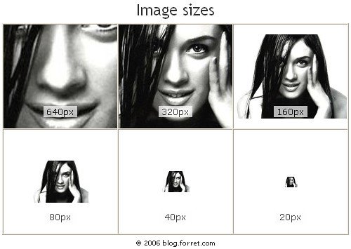
How to Resize an Image in HTML Using the Width and Height Attributes
The HTML
<img />
tag is used to embed an image into a web page. The width and height attributes of the tag can be used to resize an image. These attributes are specified in pixels, and they define the width and height of the image respectively.
For example, if you wanted to display an image that was 200 pixels wide by 150 pixels high, you would use the following code:
<img src="example.jpg" width="200" height="150" />
The above code will display the example.jpg file at a size of 200×150 pixels on your web page.
It is important to note that resizing images using these attributes does not actually change the physical dimensions of the file itself; it simply changes how large or small it appears on your web page. If you want to permanently resize an image, you should use a photo editing program such as Photoshop or GIMP instead.
How to Use CSS to Change the Size of an Image
Using CSS to change the size of an image is a simple process. To begin, you will need to have the image saved in an appropriate file format such as .jpg or .png. Once you have the image saved, you can use CSS to adjust its size.
To do this, open your HTML document and locate the tag that contains your image. Within this tag, add a style attribute with a value of “width:” followed by the desired width in pixels (px). For example:
<img style="width: 200px;" src="myimage.jpg" />
This will set the width of your image to 200 pixels wide.
You can also use CSS to adjust the height of an image by adding a “height:” attribute within your tag with a value equal to the desired height in pixels (px). For example:
<img style="width: 200px; height: 100px;" src="myimage.jpg" />
This will set both the width and height of your image at 200×100 pixels respectively.
It is important to note that adjusting either dimension may cause distortion if not done properly so it is best practice to maintain aspect ratio when resizing images using CSS for optimal results.
Understanding Aspect Ratios: What You Need To Know Before Resizing Images in HTML
Aspect ratio is an important concept to understand when resizing images in HTML. It is the ratio of width to height of an image, expressed as two numbers separated by a colon. For example, a 4:3 aspect ratio means that for every 4 units of width, there are 3 units of height.
When resizing images in HTML, it is important to maintain the aspect ratio so that the image does not become distorted or stretched out. This can be done by using CSS properties such as max-width and max-height. These properties allow you to set a maximum size for your image while preserving its original aspect ratio.
It is also possible to manually resize an image without maintaining its aspect ratio by using the width and height attributes on the tag in HTML code. However, this should be avoided as it can lead to distorted images and poor user experience on websites or applications where they are used.
In summary, understanding aspect ratios before resizing images in HTML is essential for creating visually appealing webpages or applications with properly sized images that do not appear distorted or stretched out.
Tips for Optimizing Images for Web Use When Resizing in HTML
1. Use the correct file format: JPEG, PNG, or GIF. JPEG is best for photographs and complex images with many colors, while PNG is better for simpler images with fewer colors. GIFs are best used for simple graphics and animations.
2. Resize the image to the exact dimensions you need before uploading it to your website. This will reduce file size and improve page loading times.
3. Compress your images using a tool like TinyPNG or ImageOptim before uploading them to your website to further reduce their file size without sacrificing quality too much.
4. Use CSS instead of HTML when possible to resize an image on a web page as this will be more efficient than resizing in HTML code directly in the browser window itself (which can cause distortion).
5. Specify width and height attributes in your IMG tag so that browsers know how large an image should be displayed on a web page without having to download it first (this helps speed up page loading times).