How to Use HTML Attributes to Change Image Size
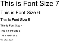
HTML attributes can be used to change the size of an image. To do this, use the width and height attributes within the IMG tag. The values for these attributes should be specified in pixels. For example, if you wanted to display an image that is 200 pixels wide and 100 pixels tall, you would write:
<img src="example.jpg" width="200" height="100" />
Understanding the Different Ways to Resize an Image in HTML
Resizing an image in HTML is a relatively simple process. There are several different methods that can be used to achieve the desired result.
The first method is to use the width and height attributes of the IMG tag. This allows you to specify exact dimensions for the image, in pixels or as a percentage of its original size. For example, if you wanted an image to be half its original size, you could set the width and height attributes both to 50%.
Another option is to use CSS styling on the IMG tag. This allows you to set specific values for width and height, as well as other properties such as margins and padding. You can also use CSS media queries to make images responsive so they resize automatically depending on screen size or device type.
Finally, it’s possible to resize images using JavaScript code. This requires more technical knowledge than either of the previous two methods but can provide more flexibility when it comes to resizing images dynamically based on user input or other conditions.
Overall, there are several different ways that an image can be resized in HTML depending on your needs and preferences. Each method has its own advantages and disadvantages so it’s important that you choose one that best suits your project requirements before proceeding with implementation.
Exploring the Benefits of Using CSS for Image Resizing
CSS (Cascading Style Sheets) is a powerful tool for web developers and designers, allowing them to create visually appealing websites with ease. One of the most useful features of CSS is its ability to resize images. By using CSS, developers can quickly and easily adjust the size of an image without having to manually edit the image itself. This can be especially helpful when creating responsive designs that need to look good on different screen sizes.
When resizing an image with CSS, there are several benefits that come along with it. First, it allows for more precise control over how an image looks on different devices or browsers. For example, if a website needs to look good on both desktop and mobile devices, then using CSS for resizing images can help ensure that they look consistent across all platforms. Additionally, since no actual editing of the image is required when using CSS for resizing images, this process tends to be much faster than manually editing each individual file in a photo editor program like Photoshop or GIMP.
Another benefit of using CSS for resizing images is that it helps reduce page loading times by reducing the overall size of the page’s codebase. Since no additional files need to be downloaded when using this method (as opposed to downloading multiple versions of an image), pages tend to load faster which can improve user experience significantly. Finally, since no actual editing needs to take place when resizing images with CSS, this process also tends to be much less resource-intensive than other methods such as manually editing each file in a photo editor program like Photoshop or GIMP which require more computing power from your computer or server hosting your website’s files..
Overall, there are many benefits associated with using CSS for resizing images including improved consistency across different platforms and devices as well as reduced page loading times due fewer resources being used during the process itself. As such, web developers should consider taking advantage of this powerful feature whenever possible in order maximize their website’s performance and user experience levels
Tips and Tricks for Optimizing Images for Webpages with HTML
1. Use the correct file format: JPEGs are best for photographs, while GIFs and PNGs are better for graphics with fewer colors.
2. Compress your images: Use an image compression tool to reduce the size of your images without sacrificing quality.
3. Resize your images: Make sure that the dimensions of your image match the size you need it to be on the webpage, as larger images will take longer to load and can slow down page performance.
4. Specify width and height attributes in HTML: This will help browsers render pages faster by allowing them to reserve space for an image before it is loaded completely, rather than having to adjust after loading is complete.
5. Use CSS sprites when possible: Combining multiple small images into one large sprite sheet can reduce HTTP requests and improve page performance significantly by reducing download time for all of those small files individually.
6. Optimize alt tags: Alt tags provide a text alternative for search engines and screen readers, so make sure they accurately describe what’s in each image on your webpage so that users can understand what they’re looking at even if they don’t see it visually or have difficulty doing so due to a disability or other issue.

