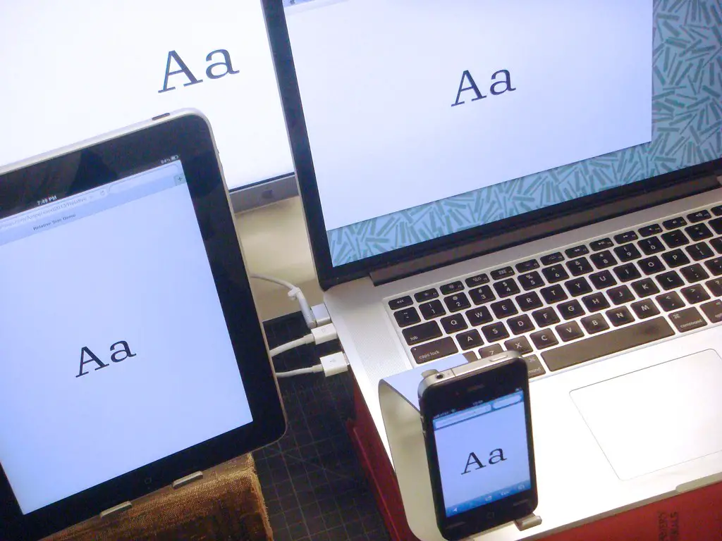
How to Change Font Size in HTML Using the Font Tag
The tag in HTML can be used to change the size of text on a web page. The font size is specified using the size attribute, which takes a value from 1 (smallest) to 7 (largest). For example, the following code will display text with a font size of 5:
<font size="5">This text has a font size of 5.</font>
How to Use CSS to Change Font Size in HTML
CSS can be used to change the font size of HTML elements. To do this, you must first define a style for the element in the section of your HTML document. For example, if you wanted to set the font size for all elements on your page, you would use the following code:
p {
font-size: 12px;
}
This code sets all elements on your page to have a font size of 12px. You can also use relative units such as em or rem instead of pixels if desired. Additionally, you can target specific elements by using classes or IDs in place of “p” in the above example.
Understanding the Different Units of Measurement for Font Sizes in HTML
Font sizes in HTML are measured in different units of measurement. The most common unit of measurement is the pixel (px). This unit is used to specify the size of a font relative to the viewing device, such as a computer monitor or mobile phone screen. Other units that can be used include points (pt), ems (em) and percentages (%).
The pixel is an absolute unit, meaning that it will always appear the same size regardless of the viewing device. Points are also absolute units, but they are not as widely used as pixels due to their lack of scalability across different devices. Ems and percentages, on the other hand, are relative units which scale according to the user’s preferences or settings.
When using ems for font sizes, 1em is equal to 16px by default. This means that if you set a font size of 2em then it will be twice as large as 16px (32px). Percentages work similarly but instead they scale according to their parent element’s font size; for example if you set a font size of 200% then it will be twice as large as its parent element’s font size.
It is important to understand how each unit works when setting fonts sizes in HTML so that your content looks consistent across all devices and browsers.
Tips and Tricks for Changing Font Sizes Quickly and Easily in HTML
Changing font sizes quickly and easily in HTML can be done using the tag. This tag allows you to specify the size of text, as well as other attributes such as color and font family. To change the size of text, simply add a “size” attribute to the tag with a numerical value representing the desired font size. For example:
<font style="font-size: small;">This text is size 2</font>
The numerical values range from 1 (smallest) to 7 (largest). It is also possible to use relative sizing by specifying “+1” or “-1” after the numerical value. For example:
<font style="font-size: small;">This text is one point larger than size 2</font>
Alternatively, you can use CSS stylesheets for more precise control over font sizes. This method requires adding a style attribute to each element that needs its font changed, like so:
<font style="font-size: 12px;">This paragraph has a font-size of 12px.</font>
With this method, you can specify exact pixel values for your fonts instead of relying on relative sizing with numerical values.
Exploring Advanced Techniques for Changing Font Sizes with JavaScript and jQuery
JavaScript and jQuery are powerful tools for manipulating font sizes on webpages. With a few lines of code, developers can create dynamic effects that allow users to adjust the size of text on the page. This article will explore some advanced techniques for changing font sizes with JavaScript and jQuery.
The first technique is to use the CSS3 transform property. This property allows developers to scale elements on a page, including text elements. By setting the transform property to a value greater than 1, developers can increase the size of text elements without affecting other elements on the page.
The second technique is to use media queries in CSS3. Media queries allow developers to specify different styles based on certain conditions such as screen size or device type. By using media queries, developers can set different font sizes depending on whether a user is viewing their website from a desktop or mobile device.
The third technique is to use JavaScript’s getComputedStyle() method in conjunction with jQuery’s .css() method. The getComputedStyle() method returns an object containing all of an element’s computed styles, including its font-size value in pixels (px). Developers can then use this value as an argument when calling jQuery’s .css() method which allows them to change an element’s style dynamically based on user input or other conditions such as screen size or device type.
Finally, it is possible to combine all three techniques together for even more control over how fonts are sized across devices and browsers: by using media queries in combination with JavaScript and jQuery methods like getComputedStyle() and .css(), developers can create dynamic effects that allow users to adjust font sizes according their preferences while still maintaining consistency across devices and browsers alike!
Troubleshooting Common Issues When Changing Font Size in HTML
When changing font size in HTML, there are a few common issues that may arise.
1. Incorrect Syntax: When changing font size, it is important to use the correct syntax. The syntax for setting font size is “font-size:” followed by the desired size (in pixels or ems). For example, if you wanted to set the font size to 12px, you would write “font-size: 12px;”.
2. Overriding Stylesheets: If your changes are not taking effect, it may be because they are being overridden by an external stylesheet or another style rule on the page. To ensure that your changes take effect, make sure that your style rule has higher specificity than any other rules on the page.
3. Browser Compatibility Issues: Different browsers may interpret HTML differently and display fonts at different sizes even when using the same code. To ensure consistent results across all browsers, use relative units such as ems instead of absolute units such as pixels when setting font sizes in HTML code.
Comparing Different Ways of Setting a Default or Global Font Size Across an Entire Website
When setting a default or global font size across an entire website, there are several different approaches that can be taken. The most common methods include using the browser’s default font size, setting a base font size in the HTML document, and using CSS to set a global font size.
Using the browser’s default font size is generally not recommended as it can lead to inconsistent results across different browsers and devices. Additionally, this approach does not allow for any customization of the text on the page.
Setting a base font size in the HTML document is another option that can be used to set a global font size across an entire website. This approach allows for some customization of text on the page but still relies on users having their browsers configured with their desired settings.
The most reliable way to set a global or default font size across an entire website is by using CSS to define it in one place and have it applied consistently throughout all pages of the site. This approach allows for greater control over how text appears on each page and ensures that all users will see consistent results regardless of their device or browser settings.
Exploring Creative Ways to Use Differently-Sized Text on Your Website
Using differently-sized text on a website can be an effective way to draw attention to important information and create visual interest. Here are some creative ways to use different text sizes:
1. Headings: Larger font sizes can be used for headings, titles, and subheadings to make them stand out from the rest of the content. This helps readers quickly identify the main points of your page or article.
2. Emphasis: Making certain words or phrases larger than others can help emphasize key points in your content and draw attention to them. This is especially useful when you want readers to remember something specific from your page or article.
3. Contrast: Using different font sizes in combination with other design elements such as color, spacing, and line height can create contrast that makes it easier for readers to scan through your content quickly and easily find what they’re looking for.
4. Hierarchy: Differently-sized text can also be used to establish a hierarchy of importance within a page or article by making certain sections more prominent than others based on their size alone. This helps guide readers through the content in an organized manner while still allowing them freedom of exploration within each section if desired.
5 . Visual Interest: Finally, using differently-sized text adds visual interest which helps keep visitors engaged with your website longer by providing variety throughout its pages instead of just one uniform look across all pages
